A collection of conversations with a diverse range of local and regional creatives
Library Conversations for SGABF2020
We examined the systems that support art book making and independent art book publishing in Singapore and the region.
A Closer Look for SGABF2019
We gathered perspectives on our zine and art book culture, and discuss the possibilities of self-publishing today.
21 Creatives for SGABF2018
We sat down with 21 creatives of various disciplines to learn about their practice and asked each of them to fill up a blank page in a notebook.
CURRENCY
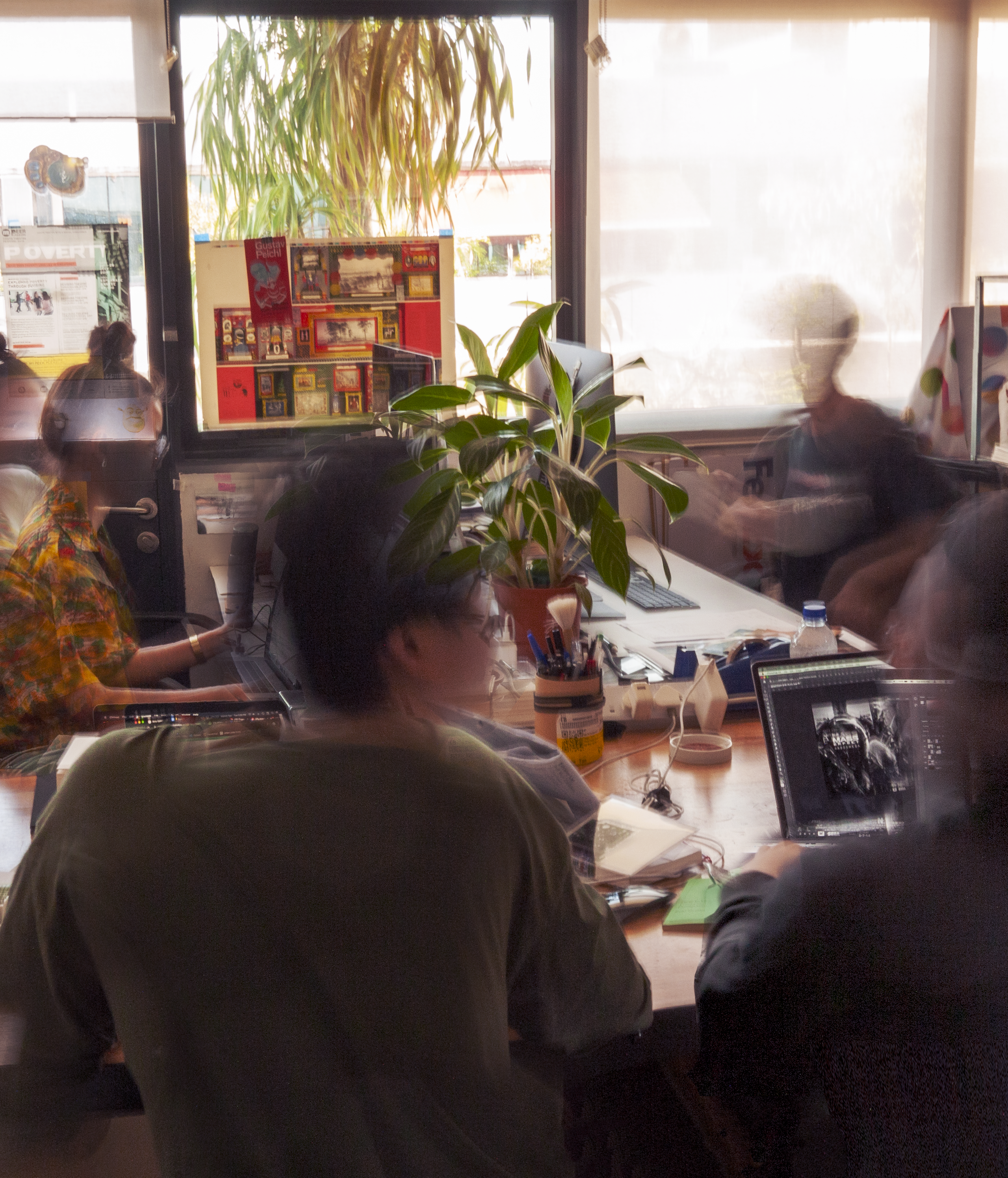 Photo Credit: Currency
SGABF: Can you bring us through the principles of Currency and the studio dynamic? How has the studio dynamic and design practice of Currency evolved?
MELVIN (M): When the idea of starting something independent first started, the idealism that comes with collaborative models that favour flexibility and avoided any sense hierarchy. This led towards something sustainable hence a more "traditional model of a studio". The team and dynamics have grown. With that also the design practice and a different model of attending to each other's strengths and interests. Today, our work fundamentally lies in dedicated process in developing strategy and good ideas, the developmental process is team-driven where depending on strengths, we add value to different aspects of projects.
SGABF: When tackling a brief like SGABF, what were your considerations when you first took on the visual identity in 2018 and how is it different this year?CHARLIE (C): The design phase started a lot later in 2018. This year, it feels like there has been a lot more time to ideate and develop the direction so our considerations are shaped less by pragmatics and time constraints than they were before.
M: The brief that we got for SGABF2018 was to, first and foremost, create an entirely different impression from the previous editions. We worked alongside Renée to rethink what a book fair can look like on an international level. As much as we wanted to challenge how an identity for a fair can look, we always discussed how the eventual design had to draw a crowd that was and still is interested in alternative forms of books and printed matter.
An art book fair is often quite eclectic so we came up with a concept that hinged on two things – using different typefaces or versions of a font to capture that sense of diversity and adopting an expressive ribbon that encircles around a book spine or bookmark for the key visual. It captured the fun nature of an event like SGABF while remaining dynamic and easily adapted across different sizes.
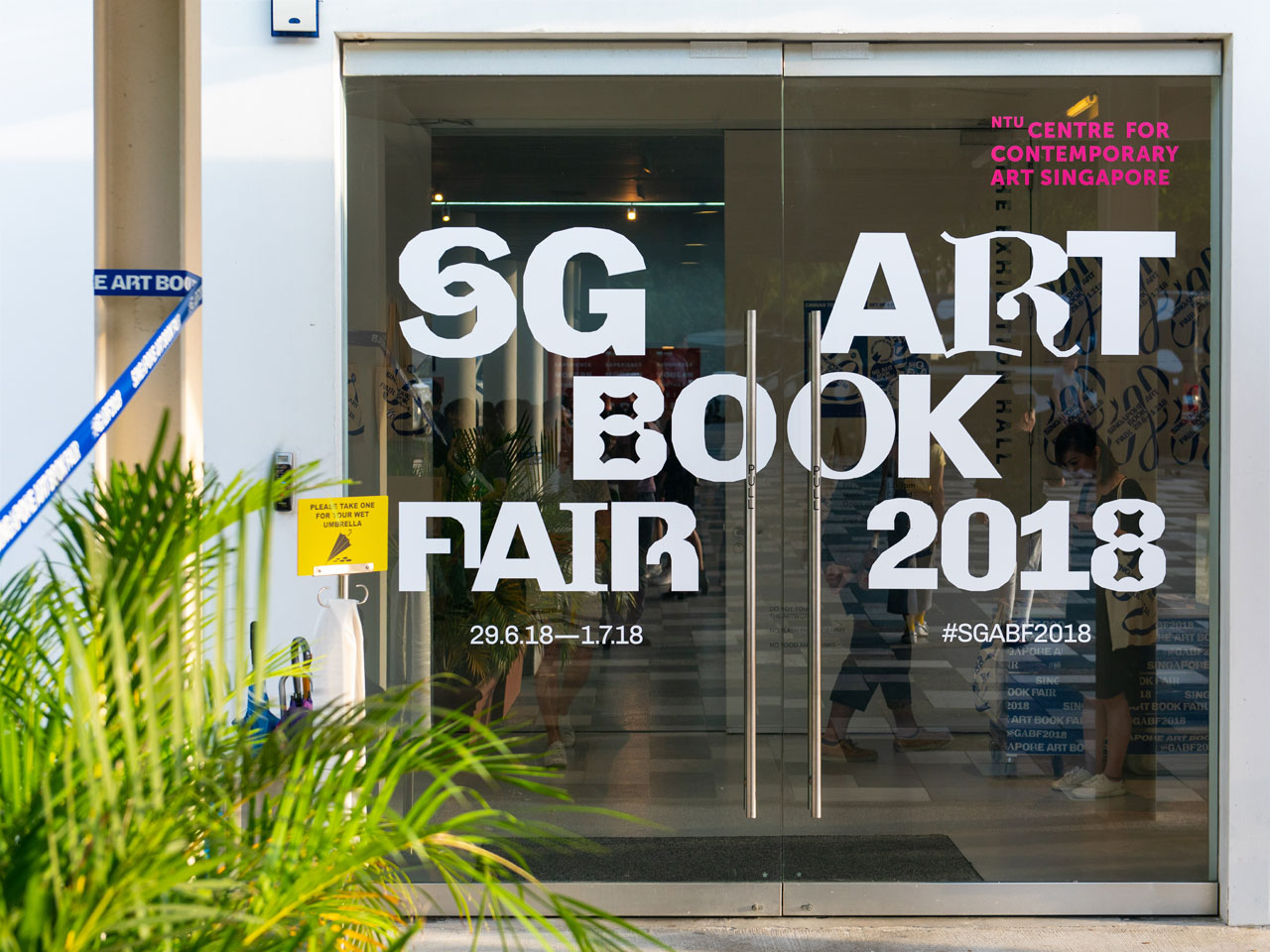
Photo Credit: Currency
Structurally, the identity for this year shares a closeness to the previous one. This year, we expanded on the central part of SGABF that is the word ‘book’. We like how the double ‘O’s can resemble two pages of a spread out book and move away from the fixation on book covers.
SGABF: The identity and design focus for SGABF2019 seems more graphic-based, whereas last year’s seemed to touch more on typography. What were the factors that motivated or contributed to the current approach?
SHENG YONG (SY): To bring out the collaborative spirit of SGABF, we thought it would be wise to get different people to express their interpretations of the word and its possibilities through motifs. Surely it’s more visually driven at one glance from the content created by collaborators. However, it’s a framework that makes the identity more content-driven and our graphical contribution actually takes a backseat. What we’re doing is putting the makers and creatives at the forefront.
M: The actual event itself doesn’t actually take place for a very long time – only three days. The identity focuses on campaign content. We established channels of communication that are key to how people understand the fair before it happens and it needs a consistent presence online because of the open call period and campaigns prior to the festival. That’s when we realised that the approach should be centred around that. It’s important for the audience. I think every edition will get better as we identify what works and what doesn’t. It’s important for us to explore and experiment with different strategies, and find out what makes the biggest impact.
SGABF: The idea for the motifs came from the desire to expand conversations and possibilities – a key principle of the Art Book Fair. What were other reasons for implementing them? Has the progression of this element so far met your expectations as to how it would inform audiences about the event?
M: I enjoy how the features as part of A Closer Look are sometimes a very intimate read and in other times, revealing. It aligns with what we are trying to do for the design – ensuring that the contributor or the feature is kept central. I think that’s the beauty of having a structure that’s purposeful, as a gateway to align everyone together. It’s representative of the art book fair, where multiple practices share a stage but what brings people together in that single space is the format of books.
SGABF: Currency emphasises on process and strategy first in design. How has this principle informed your work?
SY: We have a principle of not taking aesthetic at face value. We start by thinking around the needs of the project and expand on that before going into the visual aspect of what we do. We spend a lot of time communicating what we think is best for the brief. When everything approved comes together, we hope that the outcomes we create are sharp, appropriate and relevant. Visuals and graphic style wise, we are known to be quite experimental for some but overall, our works are quite diverse.
Photo Credit: SGABF
SGABF: Does the consumer part of you inform the design practice?
C: Being a consumer makes us think, as designers, about what people are looking out for. We end up having quite a strong idea about what stands out, and what would pique people’s interest. It’s not just the visual aspect or an effort to increase clout, which is quite telling about our principles and ideals that we try to bring into publications.
M: As much as our outcomes may hint at certain approaches, we usually start by asking a lot of questions, sussing out the audience and purpose of project. In some ways, we are servicing our clients when responding to a brief. However, we consider strategy and are also open to very experimental or non-conforming ideas. We enjoy the process of experimentation, especially when it feeds into the purpose of the project. The important thing as designers is that we don’t end up proposing something that is way off.
C: That’s right. I don’t think we do experimentation for experimentation’s sake.
M: We don’t usually begin designing very early on in the process. We refrain from jumping into the aesthetics from the get-go. I don’t reckon it’s always about problem solving either. I think we need to figure out the tone, ideals, objectives and consider if design can help.
SGABF: How do you deal with the concern of authorship as designers? Would you say that’s a major setback in your process?
M: The questions that come about with the discussion of independence and authorship as designers include: how much influence do we have in the outcome? How are we engaged as service providers? For example, the procurement process for many jobs centers on the extent of application. With a starting point like that, talking about your own personal interest or ‘authorship’ is close to irrelevant.
Photo Credit: Currency
SGABF: So ultimately, where does autonomy lie in design practice?
M: At Currency, the autonomy lies in the fact that we are a small studio, and the quality of our output depends on how we put our heads together. An idea can come from anyone in the studio, myself, or from the client. Ultimately, our sense of autonomy and independence lies in our approach and derives from our learning process. With the pervasiveness of digital technology and given the accessibility of various digital resources, there is also a problem of iteration.
C: This is one of our principles – use anything that we find online responsibly. We don’t want to rip anything off. Obviously it’s something you can’t skip out because resources can be inspiring. But I think there are standards that we set for ourselves – how inspired are we by a certain thing that we see online, for example? How many degrees away we should be from our inspiration is something that we’re very conscious about, whenever we look at something and find it interesting. And that’s something you can empathise with as well – if you notice your work inspiring something else. As a designer you do value that, if you can see that the person has strived to not completely rip off your idea, or done something a bit further removed.
M: I think looking at references is one small area of our process, if we’re stuck creatively. A lot of the time, we don’t. Perhaps, once in awhile, when we do encounter a creative block, or maybe when we’re just not sure. Our turn to references is usually prompted when we’re not sure how should we style a certain aspect or element of a project. We look at how people do it to know. It helps to accelerate that process and raise more necessary questions that we have about something we’ve not done before.
C: It’s the same as looking at a physical book. We’re constantly playing around with layouts, hierarchy, images, seeing how it’s done, referring to the books that we have lying around. Actually we do that more than Pinterest. Usually our search is very specific, like how is this done in a certain way? And then we see a possible approach, and we do a version of it in our own way or in a way that’s responding to the brief.
Photo Credit: Currency
SGABF: Based on Currency’s practice, experience and observations, how would you describe the characteristics of a critical graphic design practice – especially in the context of a landscape like Singapore?
M: I’ve talked to a few friends about critical design, or ‘critical’ as a term. I feel that there are many ways to define or characterise it. Everyone has different interpretations to critical design. Sometimes it’s a style or the nature of design practice. It’s difficult to talk about a term that is subjective or continuously evolving, especially if we see it as an approach.
Critical design does align itself to the idea of ‘ugly’ or ‘visually abrasive’ works. I think that if it’s appropriate, or if it answers a certain brief, then anyone may consider doing it. Especially in the arts, aesthetics can be a way of questioning established forms of looking and iterating and can be channelled to express beliefs, sentiments and political positions. Certain design elements can be treated in such a way, be it choosing design as a kind of conceptual gesture or artistically.
SY: In the context of our landscape for design, I guess Singapore’s scene is still pretty young. There is still quite a lot of exploration to be done. People are still pushing boundaries. To a certain extent, not subscribing or conforming to the usual design practices might be seen as ‘critical design’ because it’s going against the grain.
C: I think we see more and more people having different takes on design. So they don’t necessarily want something that’s beautiful and conforms to the most widely understood definition of good design. They may want something that’s interesting and puts a different spin on design. That could be what ends up getting called ‘visually abrasive’. People’s tastes and the discussions that they are having about design seem to be evolving more and more.
M: I've visited quite a few grad shows recently and its exciting to see graduates go about rethinking design approaches here. It’s evident from the work showcased. It shows people are ready to talk about it. I still don’t have all the answers yet, even having read articles and had conversations about it. But then again, perhaps when it’s clear, it’s no longer worth talking about it as it won’t be a particular thing in itself anymore. That said, the fashion side of visual culture is always evolving and reprising. What can be considered critical design three years ago, a time when I hear the term said more often than now, may not be the case today.
SGABF: As collaborators of SGABF, what are some actions you feel that organisations, platforms and spaces like ours can take to extend more room to interdisciplinary makers and practices in developing their craft?
M: The platform that the SGABF provides help to motivate all levels of the book-making process. We have the artists, producers, designers and printers who are all integral to the form. An initiative like SGABF that happens cyclically imbues a culture of appreciation when makers know that there is a platform to showcase their work. It might motivate someone to develop their craft within that community.
SGABF: Finally, what’s the most interesting zine or art book you’ve come across?
C: Us Blah + Me Blah
M: Mould Map 3
SY: Notes on Ghosts, Disputes and Killer Bodies by Gabrielle Kennedy and Jan Boelen
Currency is a Singapore-based design studio that offers creative direction and content.Extending from a project’s theoretical underpinnings, Currency seeks to work through contextually informed approaches to produce novel outcomes with an experimental flair.
© Singapore Art Book Fair 2025. All rights reserved.
For further enquiries, please contact us at info@singaporeartbookfair.org.
Singapore Art Book Fair is organised by
![]()
For further enquiries, please contact us at info@singaporeartbookfair.org.
Singapore Art Book Fair is organised by